Announcements
Readers, followers, collaborators, friends: thank you for your interest and support over the years. And thanks to Sitra, without whose support HDL would literally not exist. With this blog post Helsinki Design Lab is officially in hibernation.
We each maintain our interest in strategic design, so please stay in touch. And please do take advantage of the resources made available here under a Creative Commons license: HDL is yours now.
After much thought, there's no better way to end than to borrow words from the great poet Robert Frost, whose poem Riders was introduced to us by Carl Mossfeldt at HDL Global 2013.
The surest thing there is is we are riders,
And though none too successful at it, guiders,
Through everything presented, land and tide
And now the very air, of what we ride.
What is this talked-of mystery of birth
But being mounted bareback on the earth?
We can just see the infant up astride,
His small fist buried in the bushy hide.
There is our wildest mount--a headless horse.
But though it runs unbridled off its course,
And all our blandishments would seem defied,
We have ideas yet that we haven't tried.
Now that the blog is closed (or nearly so) we can reflect a bit on what it was. I asked Ben of XOXCO to take a look at the database and find what details he could dig up. Here's what he found:
Number of posts: 241
Total words published: 128,204
Average words per post: 532
First post on: January 31, 2009
Total number of days the blog was live: 1259
Averaging one post every: 5.2 days
Longest post: Guest Blog: The Takeaway is People (2718 words)
Total comments: 58
Average comments per post: 0.24
If the blog were a printed book, it would come out to about 500 pages of pure text, not including any images or other supporting materials.
One revelation from doing this number crunching is the shockingly low number of comments! Although people did not have much desire to engage, they did read. The readership grew nicely over time to level out around 5000 visitors per month:

January 2009—September 2011 (the dive at the end is due to switching from the old website to this new one)
And over that span of time we saw healthy traffic from six continents, with clear clusters around Helsinki, London, the east coast of the US, and southern Australia.
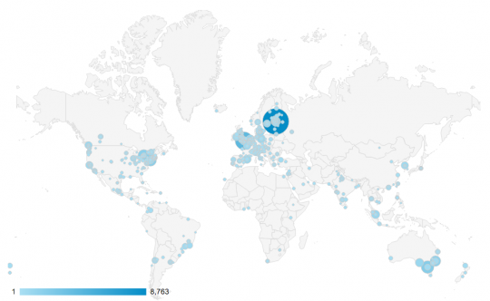
Geographic location of visitors, courtesy of Google Analytics
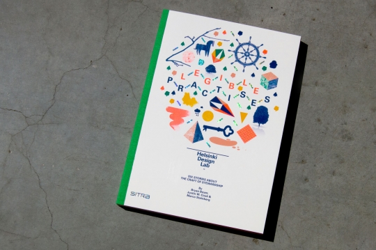
On Monday we launched our latest (and last) book, Legible Practises. This post shares the thinking behind the book, but if you just want to get your hands on it you can download the full PDF or order a copy via print on demand.
We wrote Legible Practises because we hope to bring attention to the craft of involved in stewarding institutions towards new new behaviors, new roles, and new purpose. This stems from a hunch that built slowly over five years, which is best explained in the preface:
...We have been lucky to participate in a global conversation with communities spanning from design to public service, technology to activism. Although each has its own set of tools and approaches, what struck us was the degree to which similar themes emerged again and again. The words may have been different, but the nature of the challenges and the styles of response were often remarkably comparable. Yet each spoke as though they were working in relative isolation.
Perhaps this should be no surprise, given the challenge of a world where many things seems to be changing, including the ways we live, eat, communicate, and just about everything else. As our needs span the silos of today’s society, the boundaries of our disciplines and the relationships between them will inevitably also have to adjust. Some are already doing this proactively; they know that it can be lonely on the edge.
To be an effective practitioner during a moment of flux is to be concerned with the discipline of one’s work as part and parcel to achieving better outcomes. The most accomplished practitioners do this naturally, but are often too busy to stand back and reflect publicly on a meta-level, let alone take the time to package and publish their approaches legibly. Sharing tends to focus on the endgame, without much elaboration of how it was played. When we read about promising social innovations in faraway places, we get half the story: sanitised of missteps, triumphant over adversity, effortless.
But hop on a plane and spend a day with one of these practitioners and a different story is revealed, a richer and more informative one. Last summer we had the luxury of doing just that. We listened closely to project teams as they explained their work in detail. We hosted three sessions, each bringing together two cases for a simultaneous discussion, concluding with full notebooks, large audio files, and our heads happily aching.
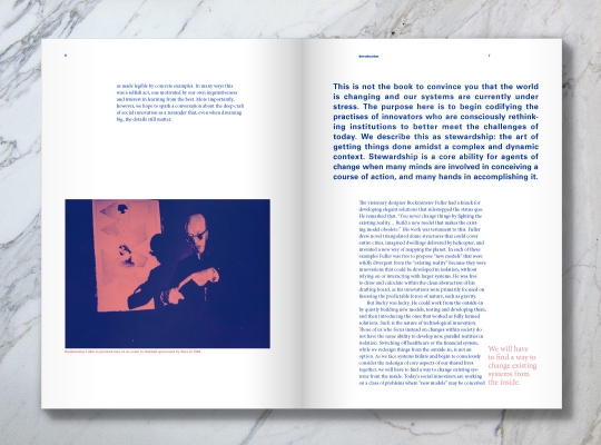
With this book we have zoomed into the promising practises of six groups to highlight shared tools and approaches, as made legible by concrete examples. In many ways this was a selfish act, one motivated by our own inquisitiveness and interest in learning from the best. More importantly, however, we hope to spark a conversation about the deep craft of social innovation as a reminder that, even when dreaming big, the details still matter.
Nesta, MindLab, IDEO, Community Solutions, Tironi & Elemental, and Government Digital Services were gracious enough to allow us to study their work. They provided the big dreams. We hosted a series of discussions, each bringing together a pair of cases, and then set to work distilling the outcomes into this text. Our work was to make the bridge between the dreams and the details explicit. We did this because we think that it might help others (including ourselves) learn quicker.
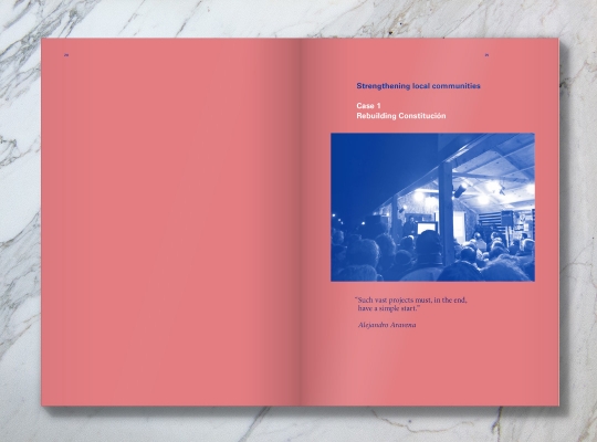
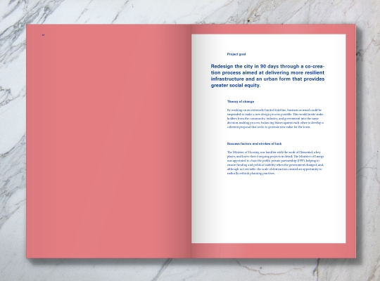
Each case is presented with a basic overview, a narrative that's a few pages long, a 'network of practise' diagram, and a series of points of practise that are illustrated by the case in question but by no means exclusive to it. In the one page overview we itemize the goal, theory of change (in our words), and strokes of luck. This last item is particularly important: if there were aspects of the project that would be impossible or extremely difficult to replicate, we've attempted to notify the reader of that upfront so that they can immediately start looking for alternatives.
The narrative does what narratives do: it gives you the overall arc of the story, describes the starting point and the status of the project (at time of writing), and introduces the main characters.
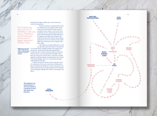
The 'network of practise' is a diagram we've invented to show a web of relationships between the points of practice in the book. This comes out of a taxonometric problem that we encountered when compiling the list of points of practice. On the one hand, it felt like we should divide them into a taxonomy with categories such as tools (data map, project blog, audio interview), methods (create upside, public beta), qualities (work at the extremes, create upside)… but this felt premature given that we've only studied six cases. We could certainly create a taxonomy, but that already implies a formality of knowledge that we were not comfortable with. One of the starting points of the study was the fact that different disciplines were all aiming at the same problem, which indicates that this moment is one of flux more than fixity. Using this network rather than a taxonomy avoids the problems of moving from one set of silos to another, and instead puts the emphasis on the individual points and how they connect.
As an open-ended system, the network diagrams show linkages between items and help the reader come to their own conclusions about the relationships between them in terms of scale, importance, and directionality. The diagrams include a mix of the points in the case in question, other cases in the book, as well as some points which are not covered at all in the book. Again, open-ended. Still in development. Evolving.
We've put our emphasis on decomposing the stories into building blocks: it's up to you to recombine them in whatever way is useful. Twopoints interpreted the networks so that each takes on its own visual form, its own identity. This leads to a good question: might we find a way to draw different kinds of institutional changes as typologies that have similar forms? Could we draw similar challenges in a way that helps an emerging community of practise develop a shared language for 'spiky problems', 'flat problems', 'round problems', etc? We have not engaged with that possibility here, for want to a large enough body of cases to do the idea justice, but perhaps at a future date.
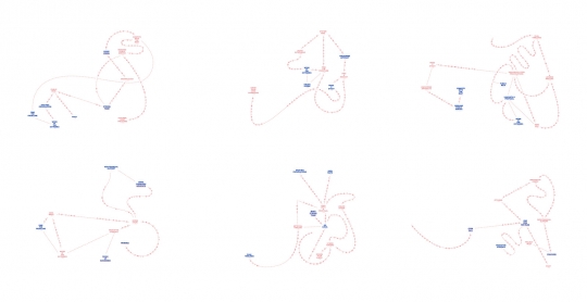
The cases take on their own identity through shape.
Next come the points of practise, which are a mix of tactics, tools, qualities, and probably some other broad categories we've neglected to see. Each point of practice is told through the case it's attached to, but is relevant to other cases as well (as exhibited in the network diagrams).
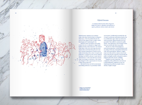
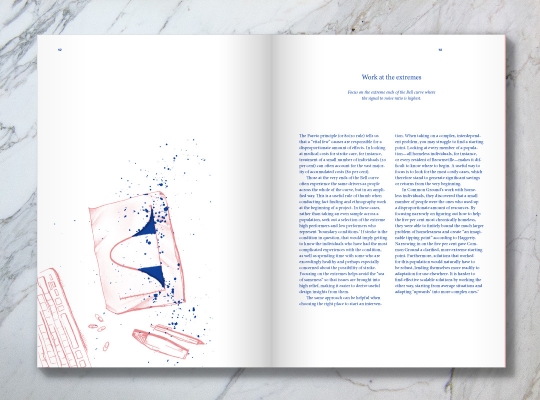
A subset of the points of practise are illustrated with drawings by Lucia Walter. This decision came out of a desire to add some visual content to the text. Choosing between photos and illustrations was rather simple: people rarely take photos of their process (unless they're like obsessive like the author of this post). But resorting to illustration was also important because it gave us a chance to bring the texture of handcraft into the book. We selected Lucia because her work in pen and ink is obviously rendered as a playful mix of purpose and happy accident. The style of the illustration is an embodiment of the notion of stewardship that we explore in the text itself.
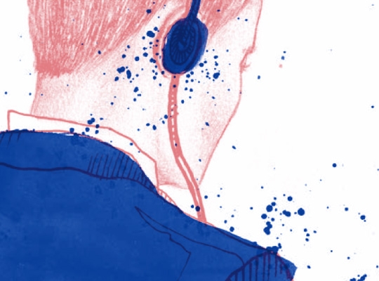
Evident handwork
Legible Practises is not attempting to be a definitive. Rather, we've hoped to nudge the discourse(s) on institutional change, on social innovation, on strategic design in a direction that engages the material practices as seriously as it does the cognitive ones. Like all of our publications, we've taken the liberty to experiment with the formatting and the execution without letting that diminish the thinking. Whether any of these experiments have worked it up to you to decide. We hope you like it.
In parallel with publishing Legible Practises as a hardcopy book on beautiful paper, with two color inks, and a swiss binding, we've also made it available via print on demand using Lulu.com. We have experimented with Lulu in the past and while it's not as nice as bespoke printing, their global distribution is important. By making the book interiors black and white we've also been able to offer it for a very low price.
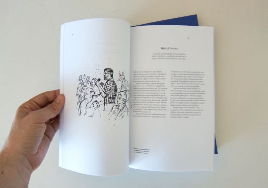
Black and white interiors mean that the books are cheap. In Studio is $13 USD and Legible Practises only $7.
And while we were at it, we also made In Studio: Recipes for Systemic Change available via print on demand.
The book we mentioned last time is now—literally right now—being printed. Copies available at HDL 2013.
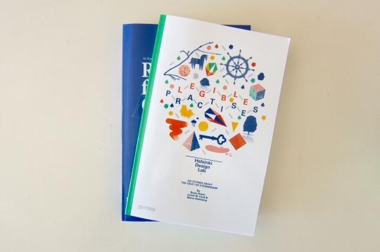
The quick update is that the three case studies we've had for a while are now available as print on demand booklets and as revamped PDF downloads. Nestled amongst the flora and minerals of Helsinki, they look like this:
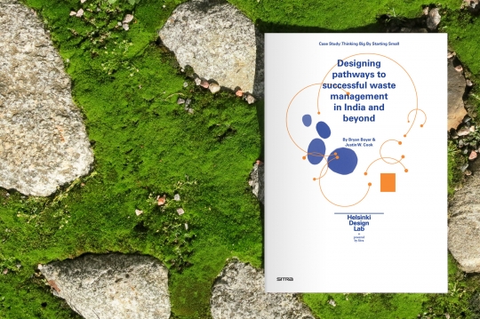
Download Thinking Big by Starting Small as a PDF, order a printed copy, or view online.
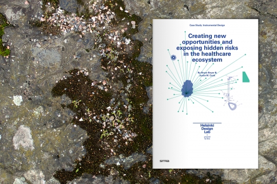
Download Instrumental Design as a PDF, order a printed copy, or view online.
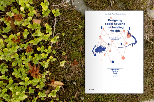
Download From Shelter to Equity as a PDF, order a printed copy, or view online.
The content is 99.8% the same, but we've changed the format. When we started this iteration of HDL we felt the need to create a bit of literature that would describe strategic design as we saw it. At that point, in late 2008 / early 2009 we had not done any Studios, Low2No was not launched yet, and the other projects were not even on the radar. So we needed examples.
The cases became those examples and we felt that it was important for HDL/Sitra to act as an objective voice that could discuss the good, the bad, and the difficult in each of the cases. So we set out to write about design in a somewhat unusual way: the subject was design activity, but we imagined ourselves writing to an audience of policymakers. The task with the cases was to figure out how to demonstrate the value of the strategic design approach. This seems more commonplace now, but there were few people using design and policy in the same sentence in 2008.
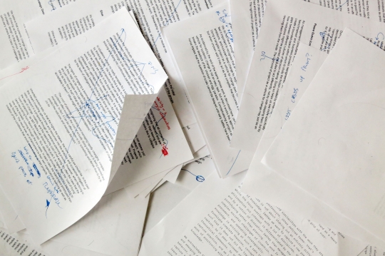
An animation depicting the writing process for the first three case studies in early 2009
This led to rather long documents that thoroughly document the work. But at the same time the length of the cases makes them somewhat difficult to approach. They're long, but what if you only have a few minutes to read?
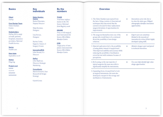
In reformatting them as booklets we've tried to address this in a couple ways. The first of which, and the only new writing in the booklets, is to provide a bullet-point overview right at the beginning. On the left column of the overview you see the story in a few bullets. On the right you see 'points of practice' that are drawn from this.
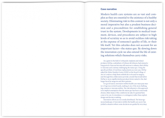
Borrowing from the design of the case pages on this website, we've started each narrative with a paragraph in large letters. As the table of contents for each one reads, if you're short on time, just read this one page. The first paragraph or two tells the story from end to end. Hopefully if you read this one page you'll be convinced to give the rest of the document a shot.
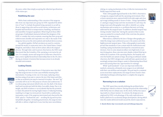
The body of the text is unchanged. We've adopted a format for these pages that puts the images in the margins as links to a figures section. In all honesty, keeping the full images in a figures section makes the layout work much quicker since we don't have to adjust the flow of the text to the images. With this done in my free time between various other projects, time was an important consideration. If we had more time it would be nice to draft a set of questions that could be used in conjunction with these documents in a teaching environment. Someday.
Redoing these cases was a pretty quick project, but I hope the extra effort was worth it, and that it gives them something of a new life. Or rather, I hope you give them a new life by downloading and reading them.
But now a moment to reflect on one of our miscalculations during the last four years. When we launched this website we thought that there would be plenty of cases out there just waiting to be documented. In early discussions with BERG, who helped us nail down our strategic positioning, we talked (dreamt?) about a regular flow of case studies. At the time we thought there must be tons of people practicing strategic design that we just hadn't met yet. We would take submissions on the site and then publish the best on a yearly basis. Or so we thought.
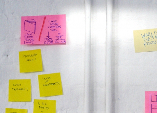
From an early strategy session. In the top left there you can see the idea of an annual case study book.
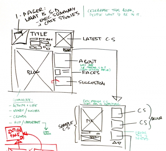
Early website wireframe: "Celebrate this book. People want to be in it."
This was before we set about drafting a long list of cases, querying our network for suggestions, and then doing the research on a short list of possibilities. What we found is that the total number of cases was in the 10s, not the 100s. The pipeline that we imagined was not gushing; it was barely a trickle. This made the cases we did find more precious, but it also meant that some of the assumptions about the total volume of work were incorrect. We were careful to be very specific about what qualified as a strategic design case study, and the result is that very little qualified. I stand by the decisions that we made about narrowing the scope, but it means that we also narrowed the volume.
Unfortunately, we were moving so quickly that this visioning process was going on at the same time as we were building the website and we faced a choice: how to handle case study submissions. On the assumption there would be a steady stream of strategic design cases, we designed an elegant case study submissions process with the help of XOXCO and Rumors Studio, who were the team that built this site.
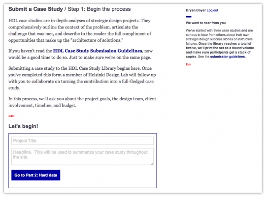
A screenshot of the submission process (still live) which gets little use.
The case study submission process is a pretty complicated thing to build but the team managed to make it seamless from a user perspective. The work is top notch, but I'm sorry to report that it has been used a total of less than 10 times. 10 times in four years! Admitting this is painful because it means that we spent money and time to automate something that didn't need to be automated because there is not enough volume. Admitting this is painful because it means I made an error of judgement.
It drives home a point made by Joi Ito, one that I refer to regularly these days, so excuse me for being repetitive: it can be more expensive to plan and prepare than it is to develop and test with real users (particularly when considering software). If I had a time machine I would jump back to 2009 and tell younger-me to slap a basic contact form on the submission page and see how it goes. Just deal with the (presumed) onslaught of poorly formatted word documents, mismatched PDFs, and random emails. Putting up with it for just a little bit means that you only invest in building software when you know it's going to return value. If there were avalanches of submissions then it would not only be worth the time and money to make an automated submission process, but we would also have examples of what the submissions look like and so we'd be better informed about how the process should work.
But I don't have a time machine, so instead that leaves us here, with me shamelessly sharing our findings and telling you not to invest money in building a custom process until you've done it manually at least 10-20 times.
I'm not fretting, though. Today we have a better handle on what constitutes a strategic design case study, we have a better network that informs us about projects here and there, and more of this design work is being practiced around the world. That's what matters.
Onwards!
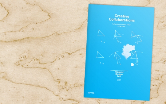
At any given moment we're working on things ranging from helping the city of Helsinki develop new service modalities for child care, to proposing a model for low carbon development, to rethinking the way governments interact with citizens—but one thing that's consistent across every project, regardless of content, is the need to collaborate. Simply put, we do almost nothing alone. Today I'm happy to announce that Sitra has published Creative Collaborations, a practical guide for working together, written by OpenEndedGroup (more on them in a second).
You can download a copy here.
By creative collaborations we mean work that, in the words of the authors:
— Follows no leader: Collaborators interact with each other on an equal basis. They engage in a freewheeling dialogue whose process and outcome remain open-ended until they come to a shared conclusion.
— Aim at invention: Collaborators occupy themselves with exploring diverse, far-flung, and even contradictory ideas, keeping at it for as long as required to alight upon a good and novel solution.
Participating in efforts such as this can be awkward, or even difficult, if one is not used to it. There's a rhythm to working together in this way and it's something that one usually needs to grow into, something that one has to practice.
More often than not we are introducing our collaborators to multidisciplinary work and for that reason we found ourselves wanting to have a guide that we could offer. Something that gives people an idea of what they might expect when being part of a creative collaboration.
To help us with this, we commissioned Marc Downie, Shelley Eshkar, and Paul Kaiser, who together comprise the OpenEndedGroup. They've honed the practice of working with others during decades of multidisciplinary arts projects, collaborating with artists such as Merce Cunningham, Bill T. Jones, and Robert Wilson as well with as with conductors, musicians, lighting designers, architects, scientists, engineers, and scholars.
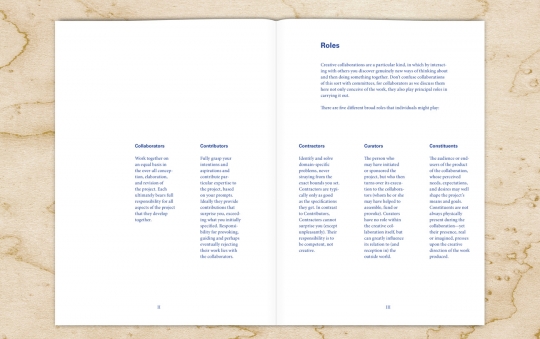
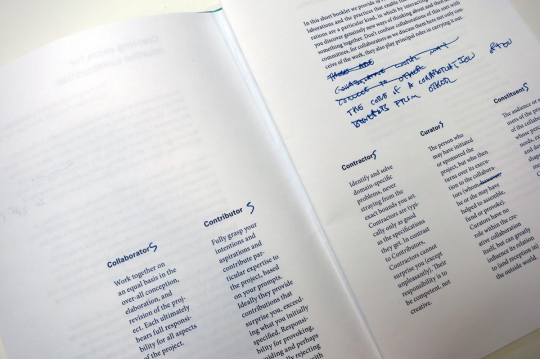
The OpenEndedGroup drafted a text that proposes five roles (Collaborator, Contributor, Contractor, Curator, Constituents) and then 19 rules of thumb for collaborators. The result is a slim booklet that reads easily and quickly. I would have loved to have had this before the Studios we did in 2010 and 2011, for instance. It will be a valuable resource for future studios and other projects.
Sharing this today is part of our continued effort to maintain a legible practice. That is, to invest part of our time in describing how we do our work—how we practice design—in hopes that it will help us learn from our peers.
And because we believe in making everything we do public, we're offering the booklet for free download under a Creative Commons license. If you're the sort who likes to read on paper, you can also get a copy via print on demand service Lulu.com.
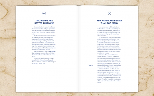
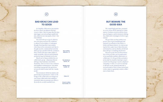
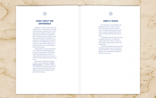
Doing the graphic design for the the booklet was one of my summer projects, and itself a collaboration with lots of back and forth between OpenEndedGroup and us as we collectively tweaked the format and the content.
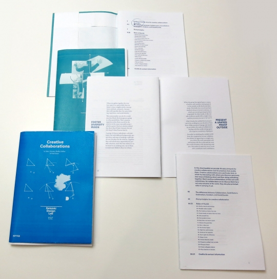
A pile of layout dummies testing different covers and interiors.
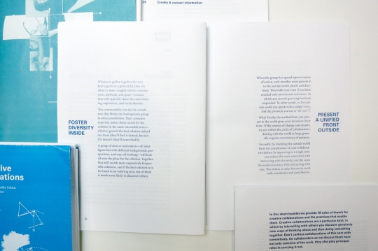
For a brief phase the booklet featured narrative typography, which worked OK on a spread like this, but was difficult to resolve on pages with content that did not lend itself directly to typographic representations.
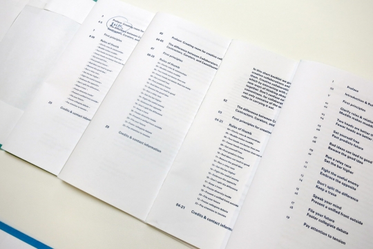
Who knew a table of contents could go through so many revisions?
Many thanks to Marc, Shelley, and Paul for their clear and concise writing. Download a copy and see if you enjoy it as much as we did.
I'll end this post with a request. On our Design Ethnography Field Guide download page we have listed alternative sources in case people want to see similar resources. If you have other resources which are useful guides for collaborative work please leave a message in the comments or let us know via @HDL2010 on Twitter so we can build a pool of resources around this topic as well.


