With the sun glinting off the Baltic and a cloudless sky stretching to the horizon, this weeknote commemorates the beginning of summer in Helsinki. Amazing.
As much as the weather may entice us to spend the afternoons biking around town in search of the perfect corner of park, we've been busy... as we usually are just before summer.
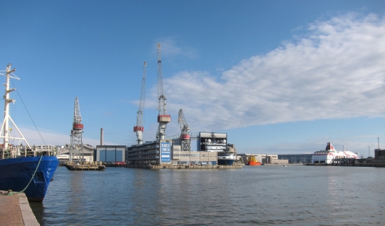
Busy day in the harbor between Hernesaari and Jätkäsaari.
Chrtistian Bason and his team from MindLab stopped by for a visit and a chat about the realities of practicing design within public sector organizations. We've been inspired by MindLab's excellent work in service design for the Ministries of Economic and Business Affairs, Taxation and Employment in Denmark. They're one of the true success stories of public sector design and as we continue our work in Finland we are looking at how to learn from MindLab while folding strategic and systemic opportunities into the mix.
We've also been reviewing and de-briefing after a very busy week with the three concurrent studios that Dan mentioned in his last post. As always, the studios were a great learning experience for us too—as the participants push and pull the boundaries of the studio 'model' we learn where the critical points are.
Riku Siivonen, a journalist who has been working with Sitra on the Synergize Finland programme, prepared a video of the week embedded below. It's in Finnish, but even if you can't understand the words you can get the gist of how things went.
At about 5:25 into the video you will find the beginning of day 5, which is the 'final review' of the studio work. One thing is conspicuously absent as the studio teams present their work: any kind of digital screen or projection.
As we sparred with the teams throughout the week we pushed them to visualize their ideas with the tools at hand. Especially as we all began to think about the final presentation from a goal oriented point of view: the idea is to conclude the studio with a conversation about the systemic understanding of the problem and a collection of action areas that the studio teams have identified as important opportunities.
It's difficult to have a strong conversation about a system when it's presented in a linear presentation (such as Powerpoint slides). What often happens is that the last thing on the screen gets a disproportionate amount of focus or there's an awkward shuffle back and forth through the slides as conversation moves from topic to topic in a nonlinear fashion. For this reason we pushed each of the teams to think about the strategic objective of the conversation and to use the walls around them—aided by giant prints—to create an environment for rich conversation that would help foster and develop their ideas.
Having the contents of the presentation on the wall enables the invited guests and the entire audience to walk themselves back through the whole collection of ideas and important points in their own order and at their own pace. Ultimately this helps the final review be more of a conversation and less of a presentation followed by response.
With encouragement (and a tiny bit of arm-twisting) each of the three teams to relied on the strength of their presentations and their public speaking skills to begin the conversation without the aid of a digital screen. This worked great and no one seemed to complain that they were without the PPT-prosthesis!
All in all it was a great week.
If I had a time machine and I could change one thing I would hop back to the beginning of last week and remove all of the post-it notes from the studio space (you'll see tons in the video). The reason for this is simple: post-it notes trick people into being lazy.
Let me explain. The way that post-it notes are commonly used in workshop settings is to capture an idea on a portable piece of paper. This paper can then be moved around at will and eventually accumulated on a bigger piece of paper and then rolled up and put into the closet and kept forever. Ideas captured. Success?
Post-it notes record ideas and allow them to be easily migrated and reorganized, but it's not a good medium for mutating and synthesizing ideas.
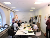
Evidence that we're not allergic to posti-it notes, just that we like their use to be a deliberate choice and not a coincidence of least resistance. This is from the HDL Ageing Studio last summer.
One of the reasons that we prefer large sheets of paper or whiteboards is that they encourage collaborative mutation. If you realize that something is drawn in the wrong place, it must be erased and re-drawn or somehow altered to meet the new intent. By drawing and redrawing, writing and rewriting, opportunities to adjust the content and format—to literally re-present the ideas—continually emerge.
When shuffling post-it notes these opportunites are lost.
Choices about how thoughts are committed to paper and in what format are the visual equivalent of tone of voice. Think about the dramatic differences in interpretation between a statement vocalized in an earnest tone of voice or a sacrastic one. The differences in perception are huge!
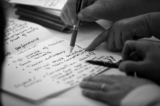
Collaborative writing session during the HDL Studio on Education (2010). Photo: Ivo Corda
By literally re-writing a statement one is able to revisit the choice of wording, its relationship to other content on the board, the scale, the color, and many other factors of the format which will inflect how it is perceived both by the author and by others... In effect, to change the tone of voice.
Even when sketching something quickly we obsess over the small details of how an idea is comitted to paper because it's in this process that a new level of richness emerges.
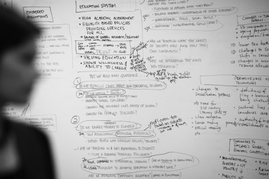
Scene from the HDL Studio on Education (2010). Photo: Ivo Corda
If a person holding a hammer is tempted to see all problems as a nail, what does it say about situations where the answer to everything seems to be a flimsy, sticky-backed square of paper? When doing new work it's sometimes important to test out new tools as well. Next time we'll hide the Powerpoint and post-it notes.
Nevertheless, congratulations to the Synergize Finland studio teams on a job well done (even with some post-its)!

As you write post-it's are good for somethings, but not for others.
If you loose them, you'll get groupthink. Or you loose the wisdom of crowds (same thing really): http://www.wired.com/wiredscience/2011/05/wisdom-of-crowds-decline/?utm_source=feedburner&utm_medium=feed&utm_campaign=Feed:+wired/index+(Wired:+Index+3+(Top+Stories+2))&utm_content=Twitter
How we've done in www.peloton.me workshops is to first use them, then cluster them, rename the clusters and then ask participants to work from the "new name" on a big piece of paper.
This of course requires a touch heavier facilitation. So in a nutshell: first use them to get rich ideas then hide them and introduce pen + paper. And then a graphic designer and a .key. Never .ppt ;)
posted by Roope — 4 weeks ago
".key, never. ppt" is a nice refrain, Roope!
Your hybrid suggestion is something that I've also experienced working well. The point that I was trying to make is precisely that these kinds of decisions should be made in a conscious way, not left as the hurried details of 'facilitation.'
Though on that question, we could go on for a long time as well. What is the difference between facilitation and moderation? or design? or leadership? or hosting? All quite different ways to breing together a collection of people and ideas. We've been brewing some thoughts on this and your comment above encourages me to accelerate it so we can include in a blog post soon.
Suffice it to say, these are rich questions if we allow ourselves to see them as such and not trivial semantics.
posted by Bryan Boyer — 4 weeks ago